Property card redesign
Streamlining the search results page for holiday bookers
My Role: UX Designer
Squad: 2 UX Designers • PO • 2 Devs
Tools: Figma • Miro • Contentsquare
Duration: 6 weeks

Background
Sykes Holiday Cottages offers over 21,000 properties across the UK & Ireland. However, research revealed users struggled to find and compare key information on mobile property cards, making their holiday home search overwhelming.
Hypothesis
We believed that reducing visual complexity and improving information hierarchy in mobile property cards would help users find and compare key details more efficiently, leading to increased conversion rates.
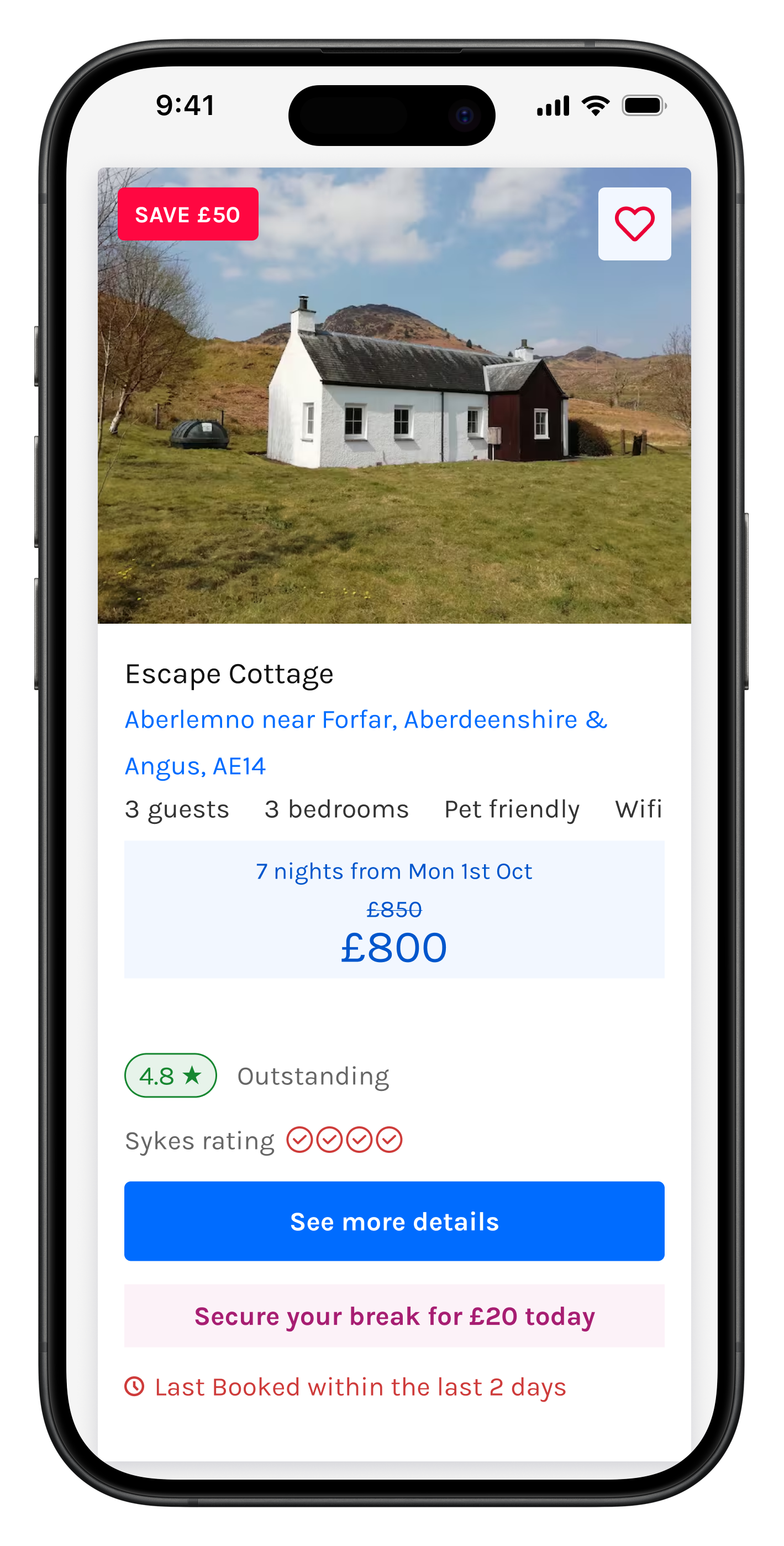
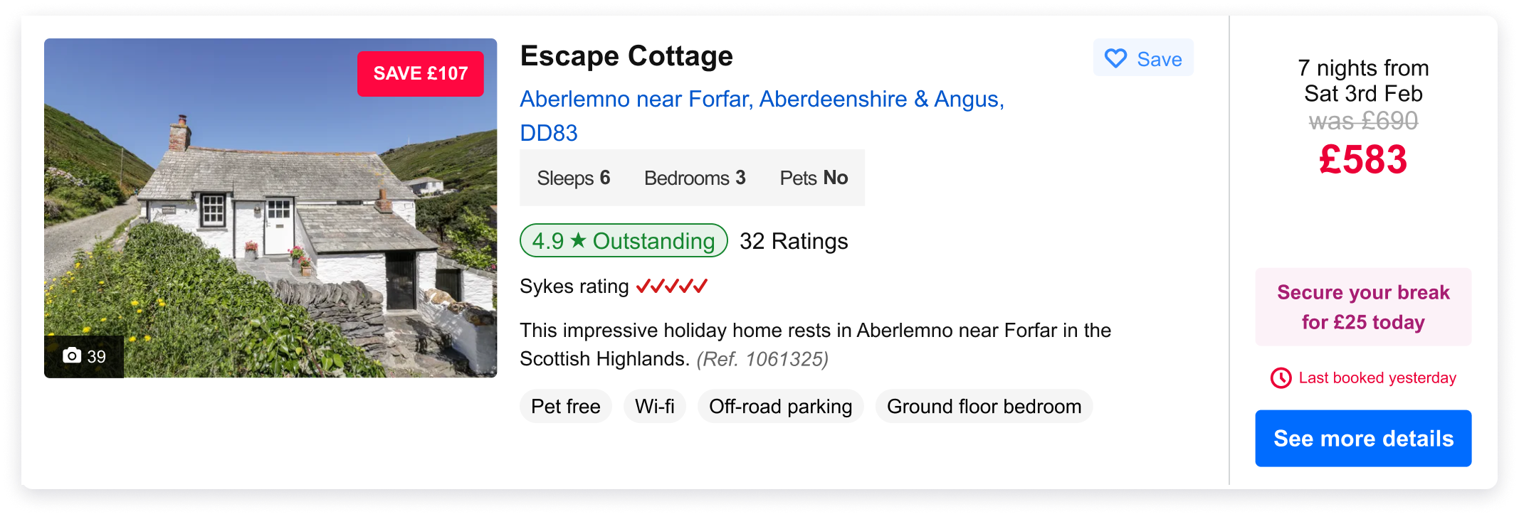
Previous version
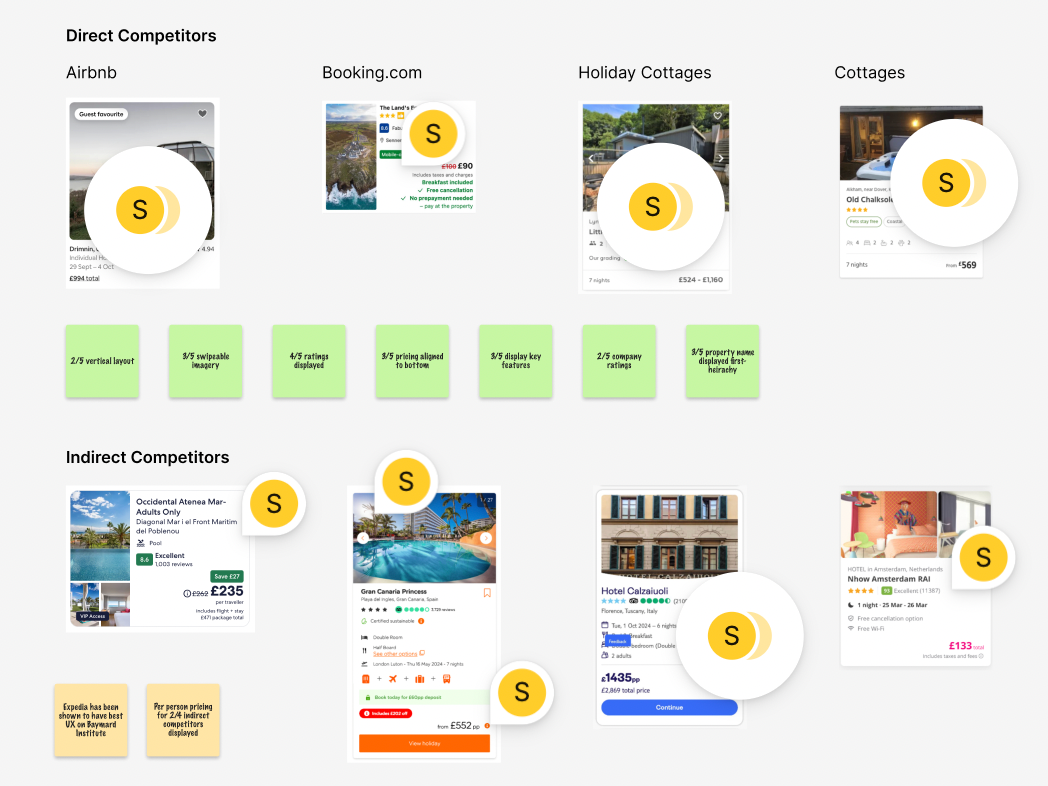
Competitor analysis
To identify industry standards and best practice, I analysed property cards across direct competitors (Airbnb, Booking.com) and various travel industry brands.
Key insights:
Limited use of call-to-action buttons
Modern, minimal design to emphasise key elements
Clear typography for improved readability
Swipeable imagery for easy property comparison
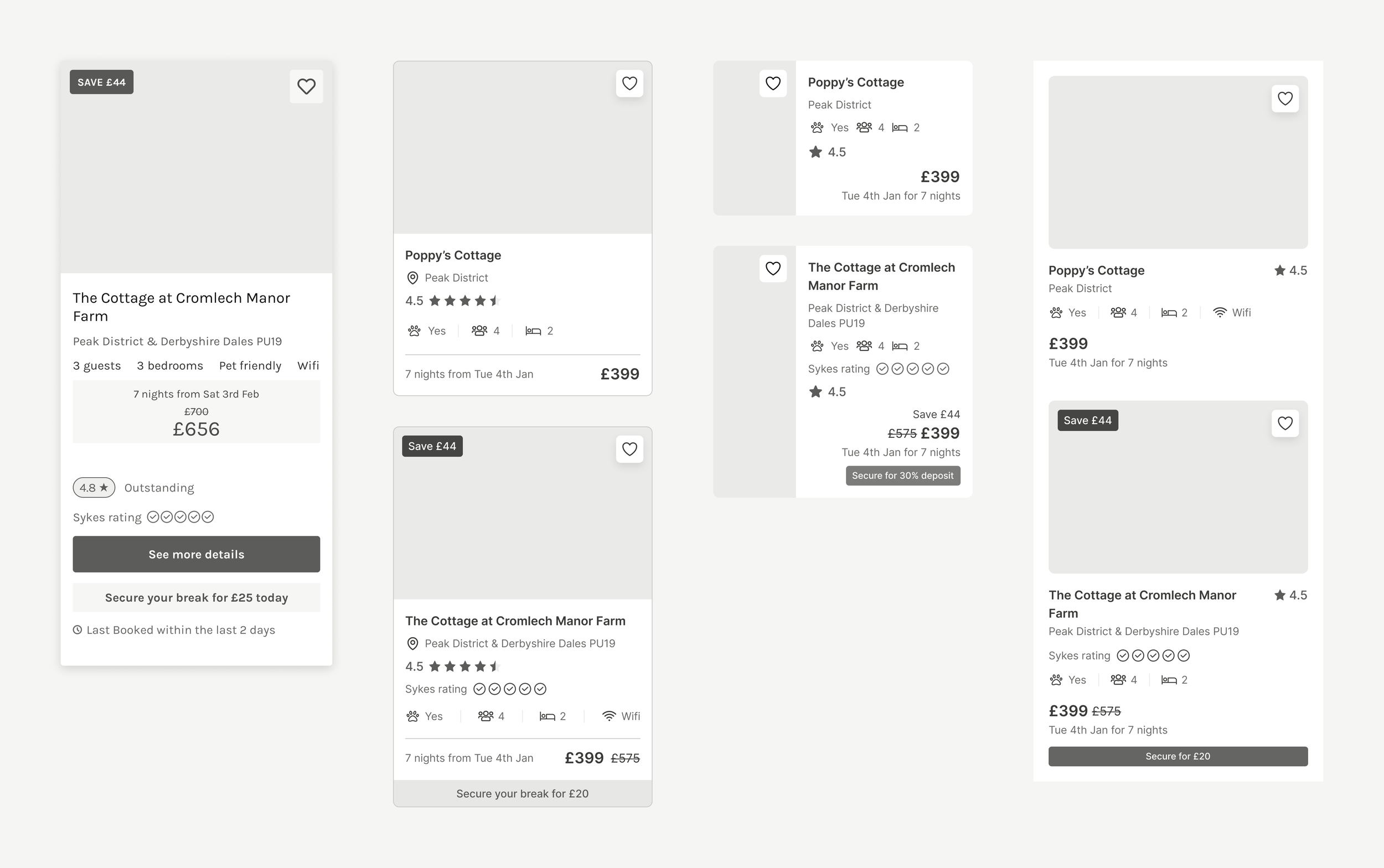
Wireframing
Sketched potential solutions to improve visual hierarchy and reduce cognitive load, following minimalist design principles.
Mocked up both best and worst-case scenarios for each concept to ensure a comprehensive evaluation.
Ran a feedback session, gathering dot votes to narrow down solutions.
Usability testing
Compared two new card designs against the previous design (100 participants per design)
Click tests measured success rates and time on task for locating key information on the property cards
Integrated survey captured qualitative insights
Key findings:
Both new designs outperformed existing control design, with users locating key property card information more efficiently. Users had increased confidence with Design A and strongly preferred its swipeable imagery feature.
“The info is displayed in a digestible manner, the size is good and the colours make it easy on the eye.” - Participant A
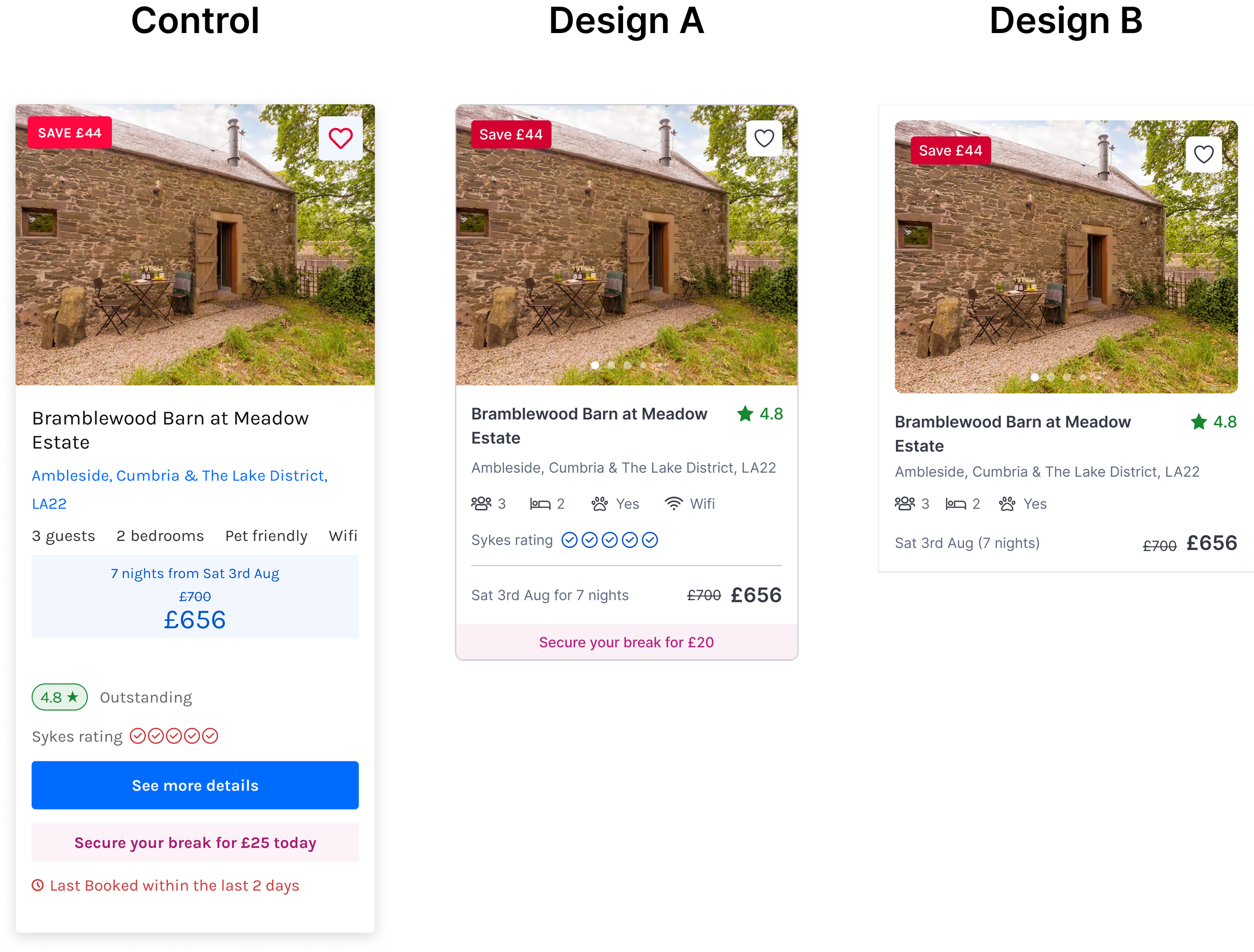
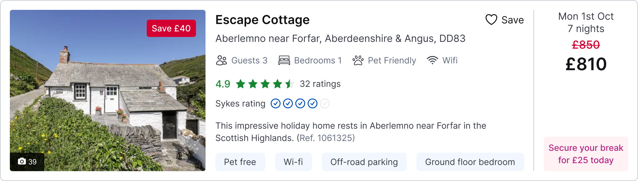
Final Design
Based on research findings, I moved Design A forward for implementation, featuring:
Reduced property card size for better scannability.
Improved hierarchy of key details.
Refined colours, typography and spacing.
Introduced swipeable property images.
Removed unneeded primary button.
Previous version

Updated design

Impact
↑ 4% conversion uplift over 4 weeks
+ 190 bookings

↓ 9s time on search
↑ 345% increase in image interaction

Next steps
New desktop and tablet property cards are ready to be tested, iterating on the successful mobile experiment.
Exclusion tests on mobile property cards to move towards a further streamlined layouat.
Previous design
Experiment