Checkout conversion rate optimisation
Optimised the checkout experience to reduce friction and increase booking conversions
My Role: UX Designer
Squad: UX Researcher • PO • Developer
Tools: Figma • Contentsquare • Tableau
Duration: 6 months
Problem statement
Research showed our checkout process takes longer than competitors. Usability issues were causing friction and drop-off rates, impacting booking conversion rates.
Approach
We gathered user insights and Contentsquare data to surface opportunities in cross-discipline momentum sessions. Ideas were added to an Opportunity Solution Tree and prioritised with the PO and developer. I designed the A/B tests; the squad built and ran them, and results were fed into our roadmap for iteration.

A/B testing and findings
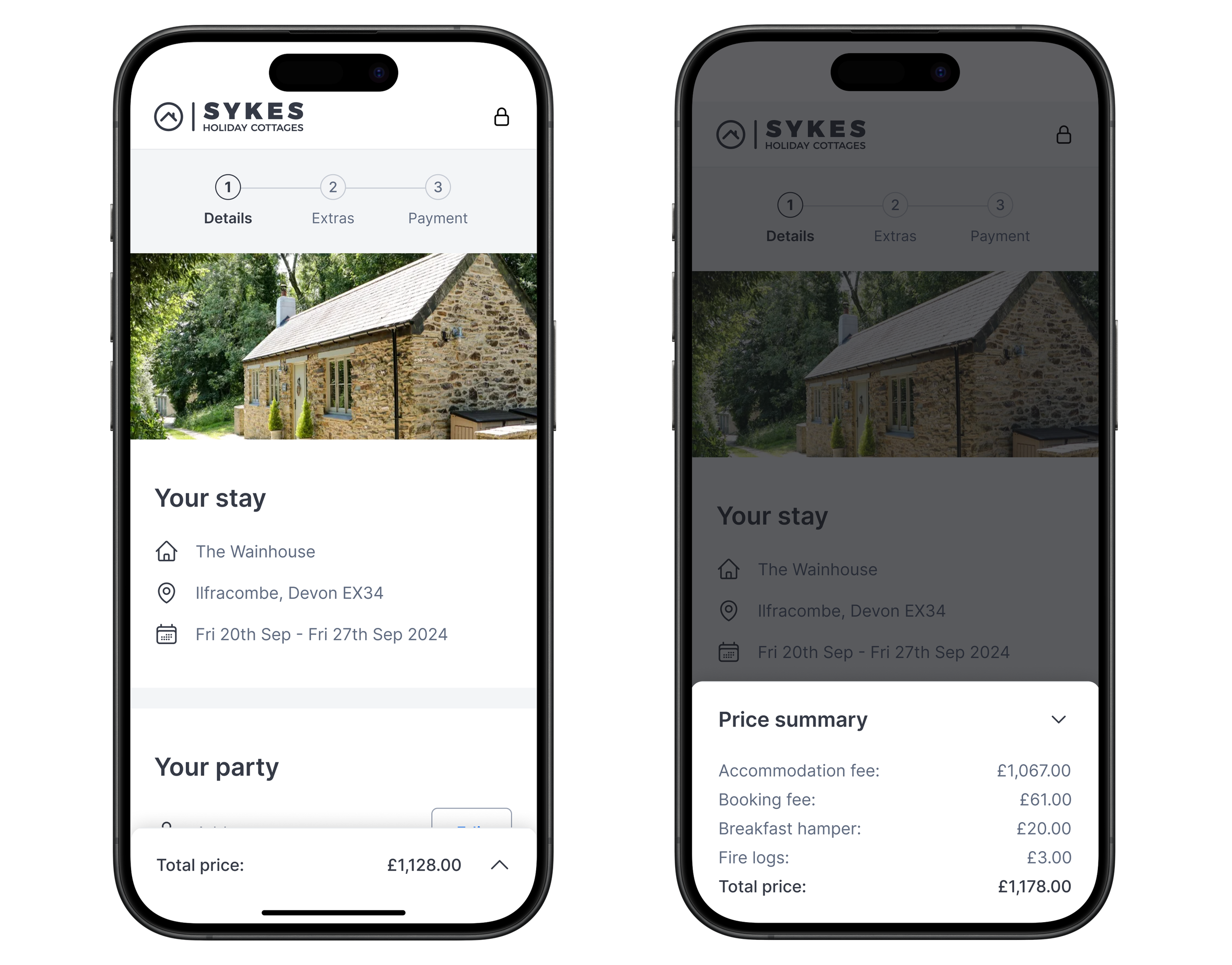
Test 1: Fixed price summary
↑ 3% conversion uplift
+ 198 bookings over 20 days
Hypothesis: Users were unclear about total costs during checkout; providing a fixed price summary could reduce confusion and drop-offs.
Solution: Add a fixed price summary to the bottom of each checkout step. Users can click to expand the price breakdown at any time.
Next steps: Test variations in placement, visibility, or breakdown format to see which best supports completion.
Price modal open
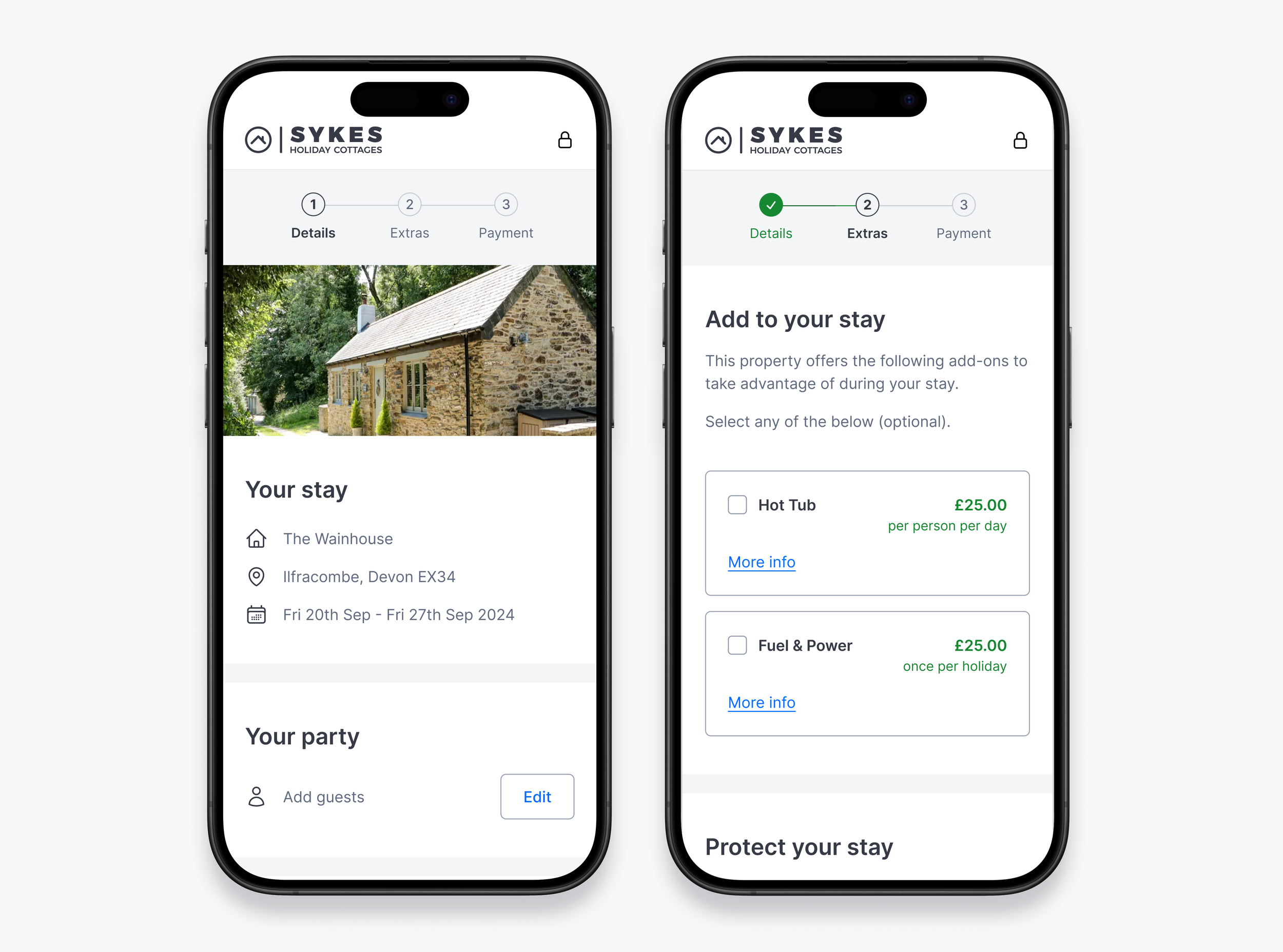
Test 2: Progress stepper update
↑ 2% conversion uplift
+ 240 bookings over 18 days
Hypothesis: Users were navigating back and forth on progress steps, leading to checkout exits. Simplifying the design could help users progress more smoothly.
Solution: Make steppers non-clickable, remove interactive cues, and update colours to make progress clear.
Next steps: Iterate on progress indicators and visual cues based on user behaviour.

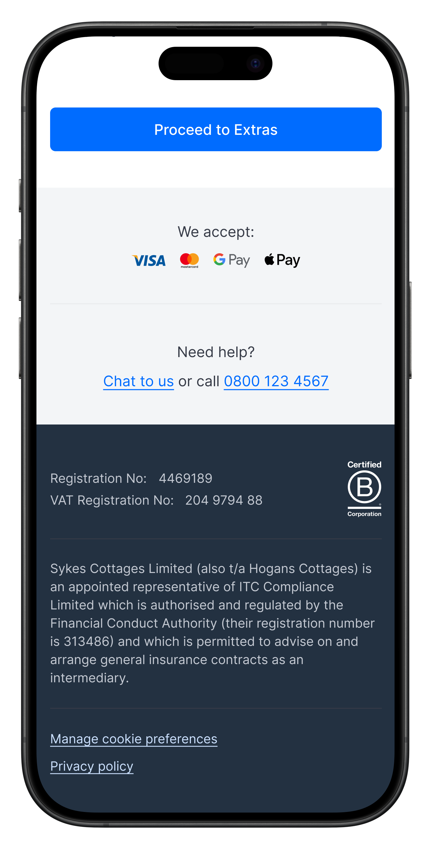
Test 3: B-Corp trust signal
↑ 1.7% conversion uplift
+ 192 bookings over 25 days
Hypothesis: Users hesitated at checkout due to trust concerns; showing credible certification could increase confidence.
Solution: Add the “Certified B-Corporation'“ logo to the top of the footer to communicate credibility and build trust with users.
Next steps: Test additional trust signals, such as a padlock icon or secure messaging near the payment CTA.
Test 4: Low-deposit alert
↑ 2.2% conversion uplift
+ 260 bookings over 20 days
Hypothesis: Previous experiments suggest that reminding users about low-deposit options can increase deposit uptake, and encourage booking completion.
Solution: For bookings more than six weeks away, if users select “standard deposit” or “full payment,” display an alert reminding them they are eligible for a lower deposit.
Next steps: Test alternative alert wording, timing, or placement to see which most effectively drives completed bookings.

Test 5: Showing payment options will be available later in the journey
↑ 1.9% conversion uplift
+ 230 bookings over 30 days
Hypothesis: Moderated user research findings show that users enter checkout to confirm the holiday cost, and to see what payment options are available.
Solution: Added “Spread the cost” messaging beneath the progression CTA on mobile.
Next steps: Test moving the payment options into the first step of checkout.

Reflections
Refining the checkout experience through iterative, user-focused design by removing friction, clarifying information, and adding trust signals produced measurable increases in completed bookings.
Next Steps
These experiments feed our ongoing momentum sessions and the Opportunity Solution Tree, creating a steady pipeline of validated improvements to scale across the product.