Property owner onboarding homepage
Streamlining the onboarding homepage for property owners
My Role: UX Designer
Squad: 2 UX Designers • PO • 2 Devs
Tools: Figma • Miro • Contentsquare
Duration: 6 weeks in design
The problem
Users were struggling to understand the Sykes' primary owner acquisition page due to an overwhelming amount of information, weak value exchange, and unclear CTAs across the page.

Hypothesis
Reorganising content into a clear flow and surfacing key value points early will reduce cognitive load and increase user trust.
Previous design
Research review
We reviewed previous research, analysed ContentSquare data and conducted a UX audit to identify key issues:
Trust signals needed before asking for commitment.
The estimated earnings calculator and contact form were the most engaged-with elements.
Need to support both high-intent and research-focused users with different paths.
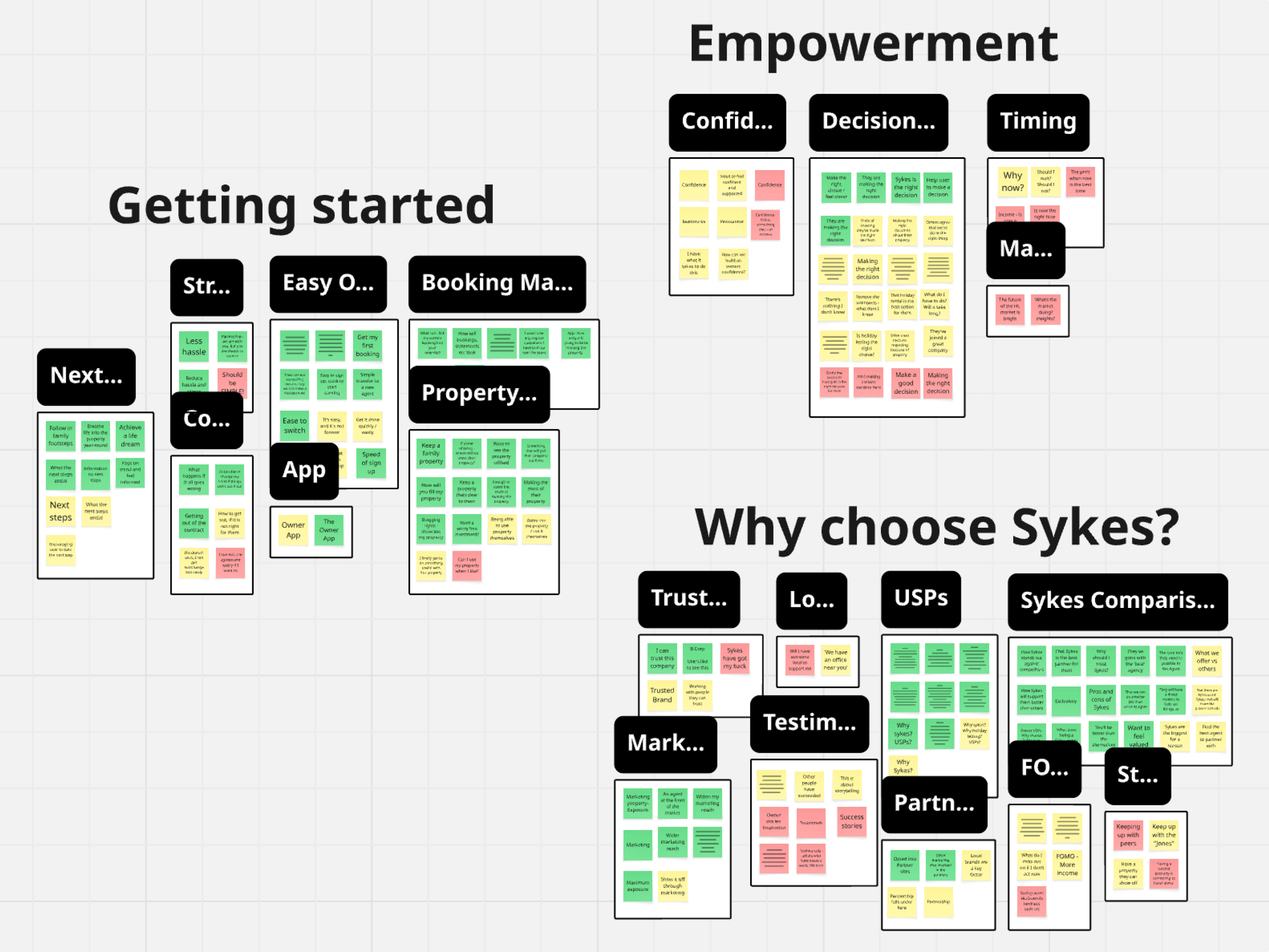
Thematic analysis
Facilitated cross-functional workshop to prioritise content and consider user flow with senior stakeholders.
Conducted thematic analysis using workshop data to identify key themes and ideate logical user flows.
Collaborated with my UX Designer colleague throughout process, providing regular updates to the Head of Product.
Lo-fi
Competitor analysis – reviewed holiday-let sites and Mobbin for patterns and opportunities.
Sketches – explored multiple layout and feature options.
Lo-fi mockups – mocked up each concept to compare flows and evaluate against user needs.
Feature prioritisation – aligned priorities with stakeholders and marketing.
Earnings Calculator
Challenge
Contentsquare data showed the earnings calculator was a key driver of enquiries, but it was positioned halfway down the page.
The cluttered, outdated UI added cognitive load and created a frustrating user experience.
Solution
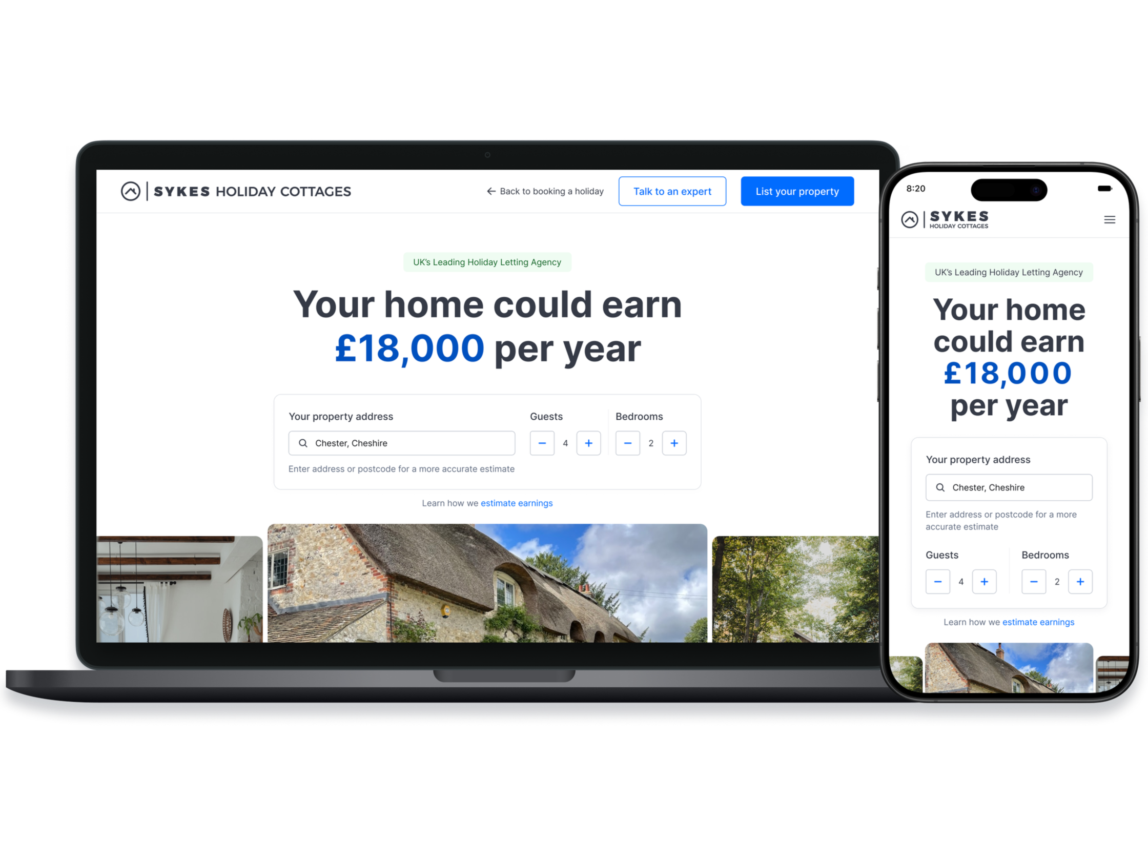
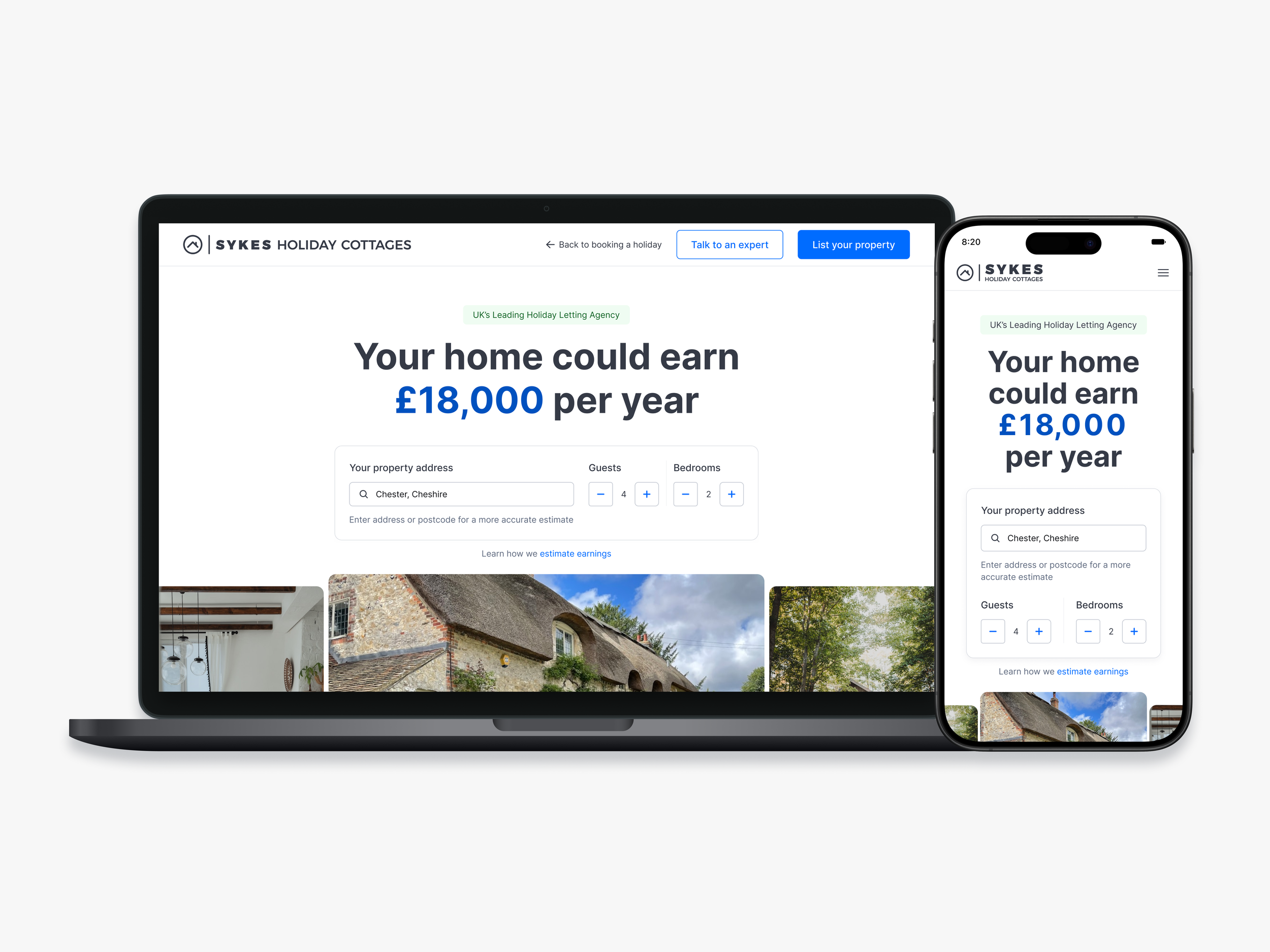
I gave the calculator a UX/UI refresh and moved it to the top of the page, transforming it into the hero section.
By making our main value proposition immediately visible, aiming to remove friction for users and increase enquiries.

Before
After
Final homepage design
Hero & value proposition
Upfront earnings estimate shows value early and encourages interaction.
Trust signals show credibility, reassuring users.
Clear CTAs support both high-intent and research-focused users.
CTAs appear contextually under key content, then stick to the footer on scroll.

Key USPs
5 key USPs laid out as paired images with benefit-led headlines for easy scannability.
Rewrote copy to be clear and jargon-free.
Storytelling builds trust.
Simplified and clean, brand-aligned UI.

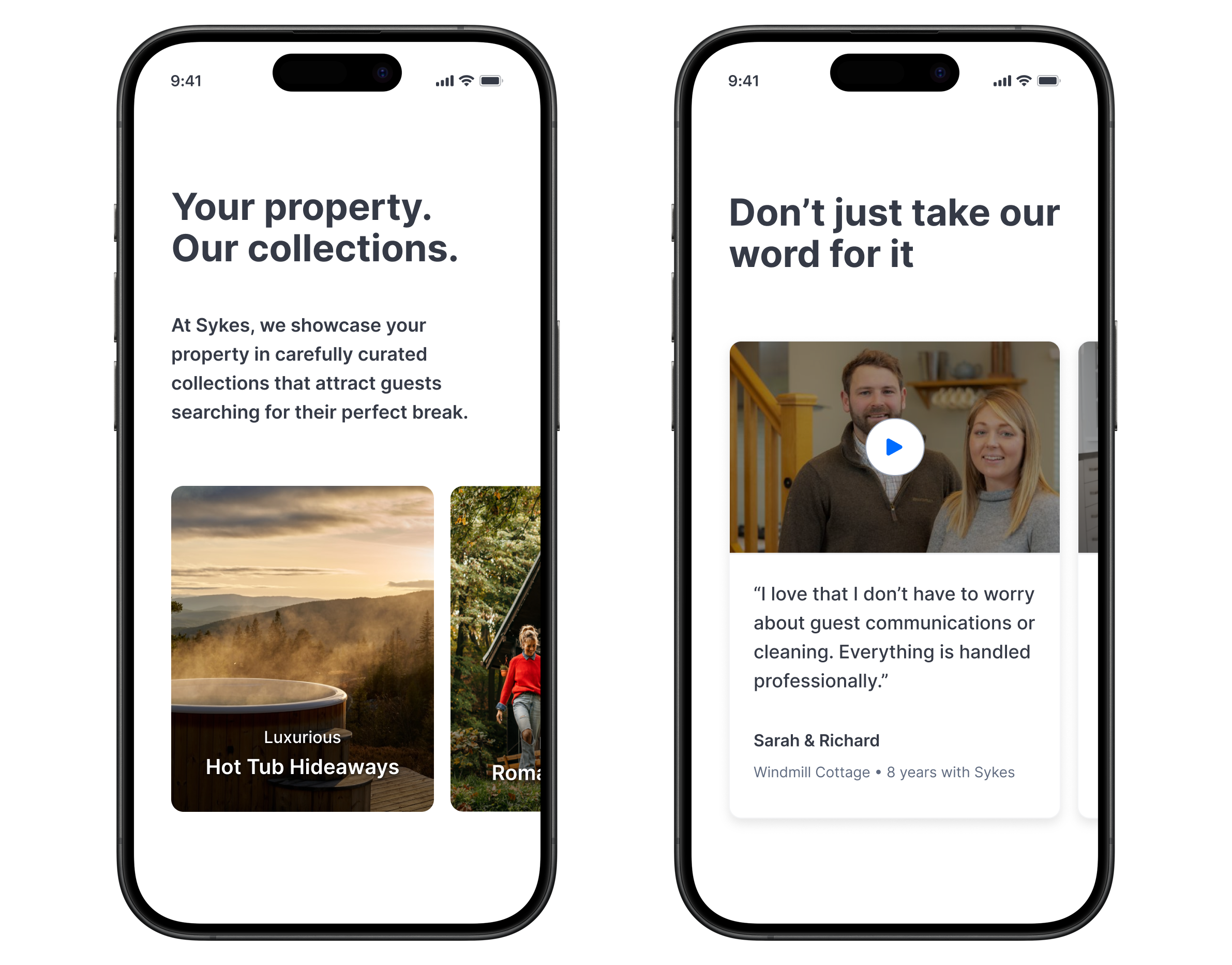
Collections & testimonials
Themed image cards blend marketing taglines with real guest demand (e.g. hot tubs, glamping).
Layered social proof with a concise owner quote and an optional video for deeper engagement.
Mobile‑friendly carousel keeps exploration seamless without overloading user.
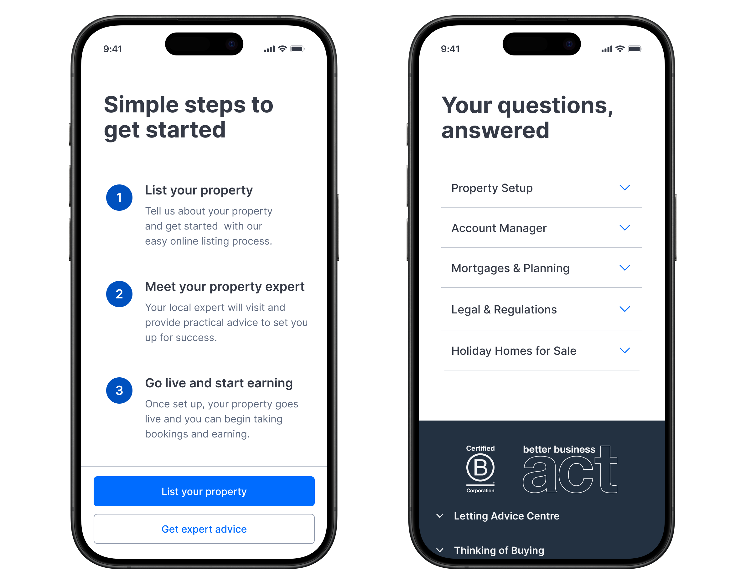
Onboarding steps & FAQs
3 clear steps to guide users to get started.
Accordion FAQs after steps answer top concerns for both high-intent and research-focused users.
Trust signals to reinforce credibility in footer.
Project status
The project is now in development, with UX and QA reviews in place to ensure visual fidelity and smooth interactions.
Due to the short timeframe, usability testing wasn’t possible before launch, so validation will come through A/B testing. Success will be measured by enquiry form submissions, calculator interactions, and bounce rates (via ContentSquare).
The first iterations focus on the enquiry form flow and calculator functionality. Looking ahead, I’d extend validation with moderated usability testing post-launch to feed into future refinements.